Notes on the 12 Principles and the beginnings of character design

Drafting how I could depict a shape showing emotion – the first was a concept in which the ball zips around the screen (I would probably use a lot of smear frames), and the second was a sad, melting shape becoming angry and then melting again. I liked this looping motion, but i felt that the emotions didn’t translate as well as the first idea.
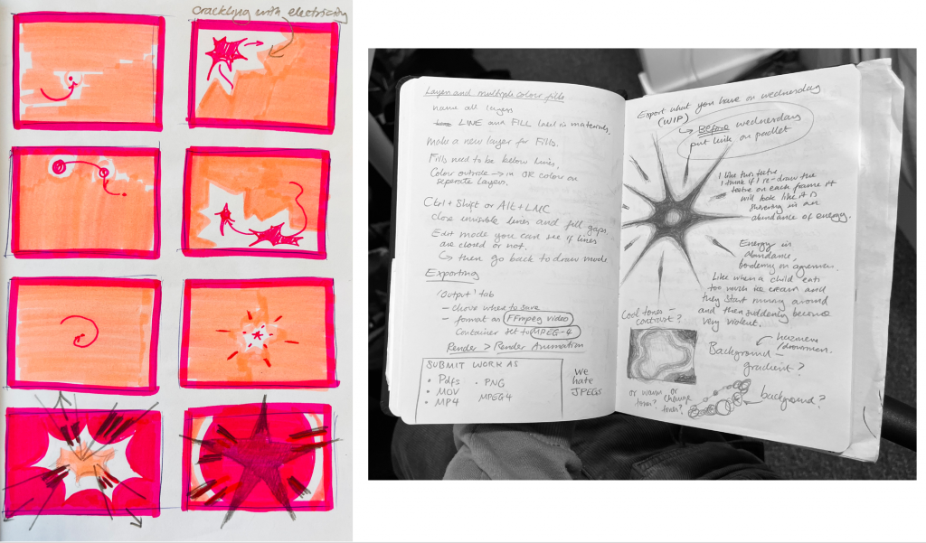
More drafts – how could the shape interplay with the background? I was thinking of creating a border around it varying in size when the shape crackles with energy. I really liked the last two drawings in dark pink – i thought the sketchiness of the pencil was an interesting texture that could convey the movement of the shape, especially if I drew this sketchiness frame by frame.
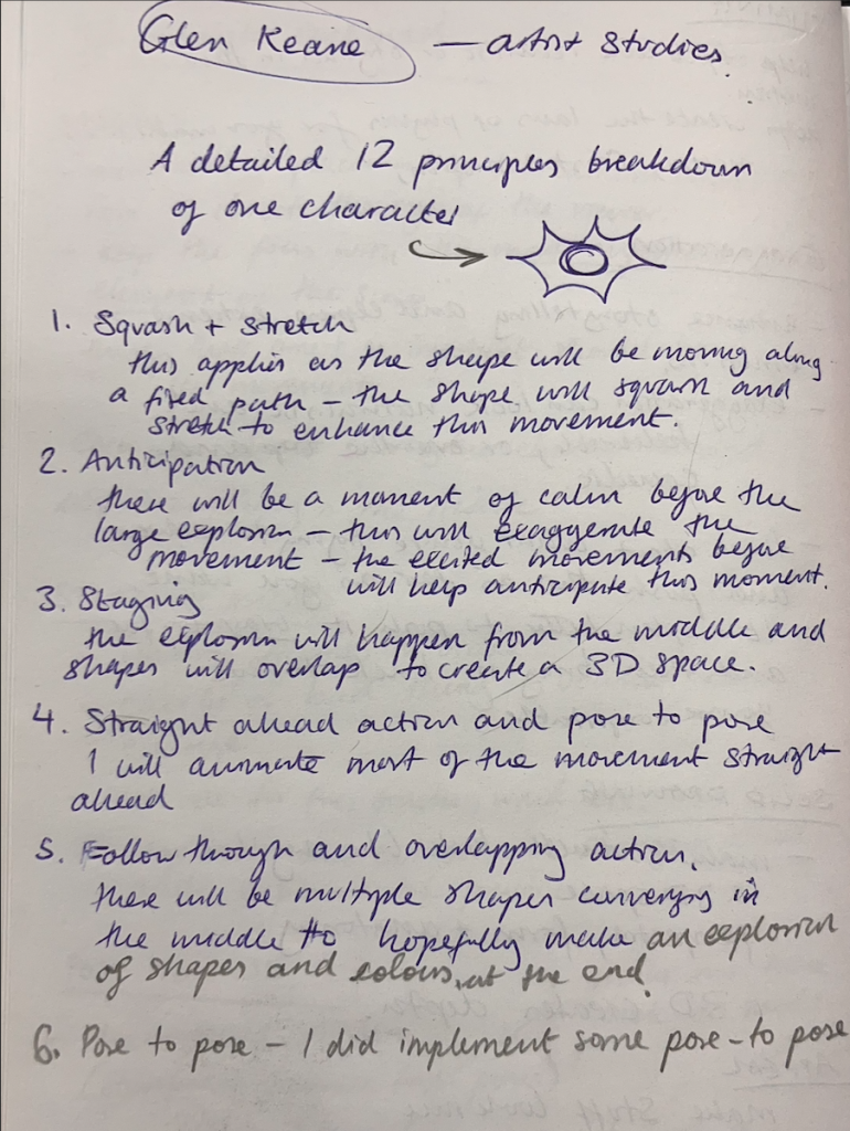
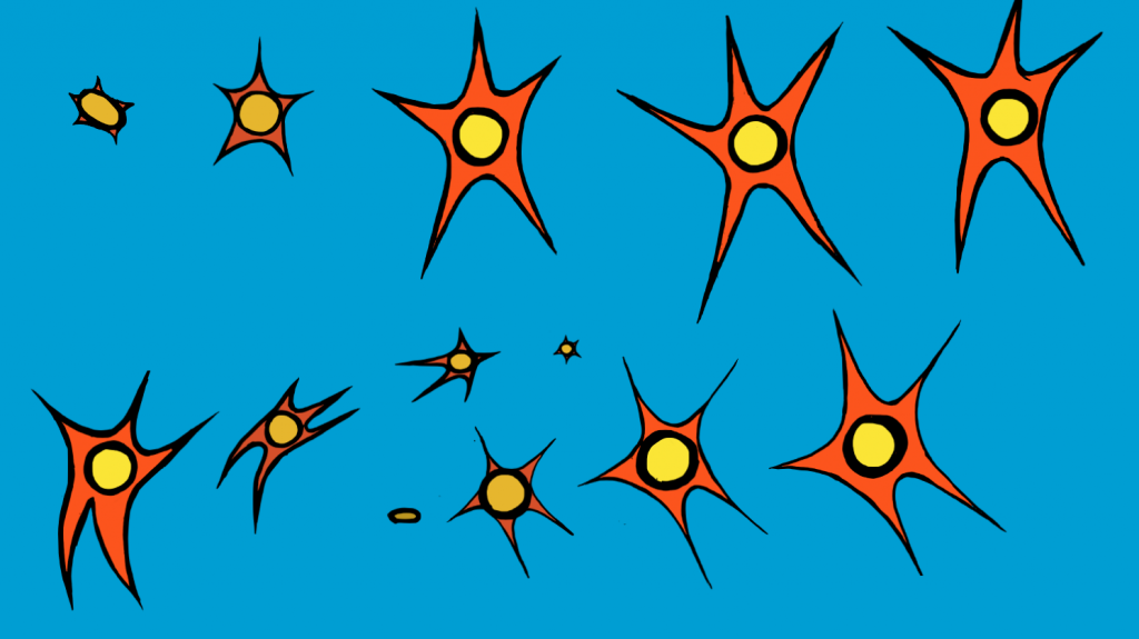
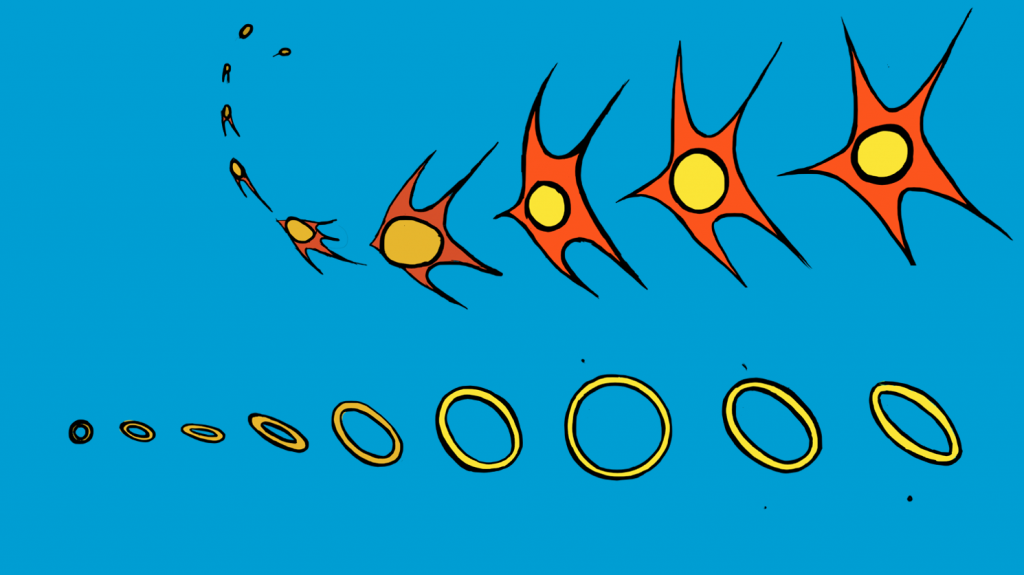
Breakdown of one character – at this point, my character design consisted of a ball with spikes because I didn’t want to make it too complicated to move frame by frame. I kept the circle in the middle of the character because I think it helped to retail the sense of weight, so I would be able to squash and stretch the circle as it moved along arcs in a path.
(Below – working in blender – creating arcs through timing)
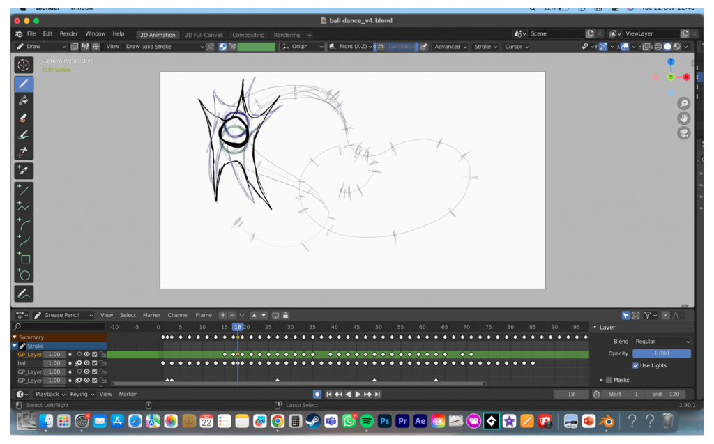
(EXPAND) Tech Problems Working on Blender Drafts
One of the problems I ran into was that blender did not work on my laptop, as it crashed and I lost a lot of progress. I had to draw the last frames of my draft on trackpad, which severely impacted the quality of drawing. It was readable to some extent, but my next steps are to refine the lineart and I decided to use the LCC Digital Space for this.
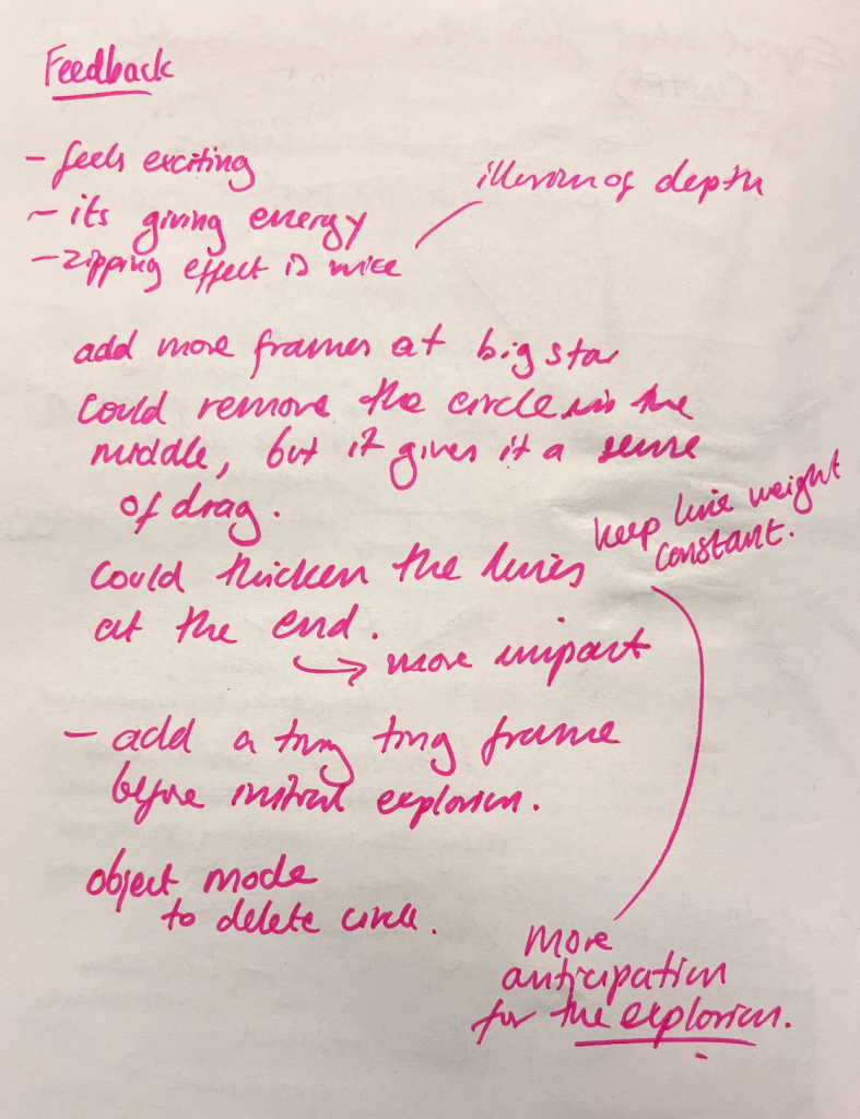
WORK-IN-PROGRESS FEEDBACK
- feels exciting
- its giving energy
- the zipping effect is nice, it gives the illusion of depth
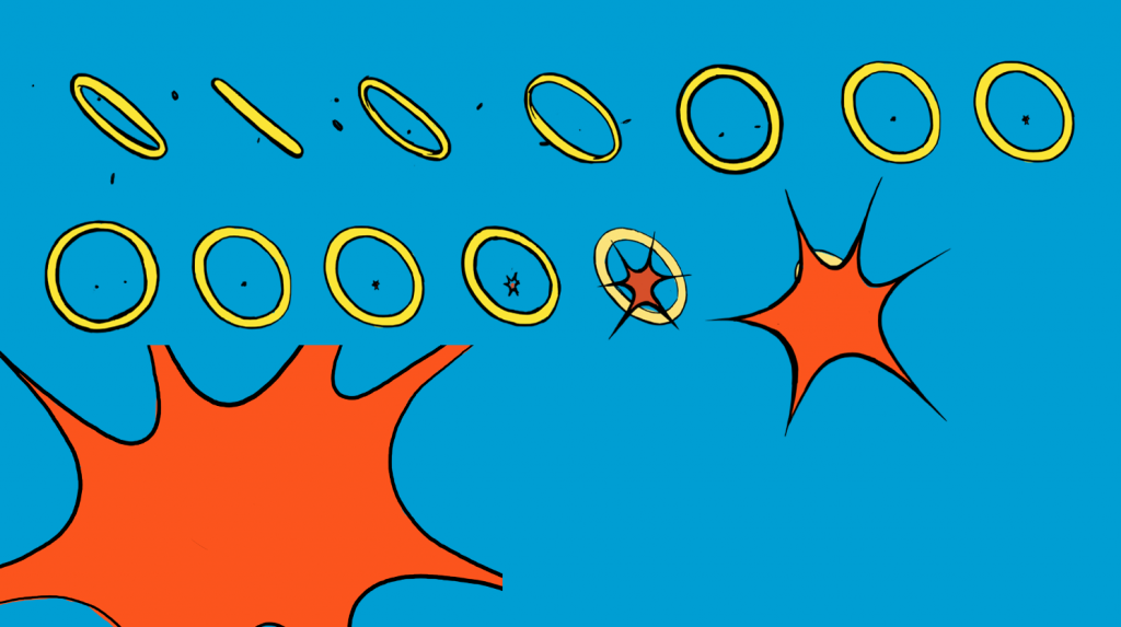
- add more frames at big star, could remove the circle in the middle, but it gives it a nice sense of drag
- could thicken the lines at the end for more impact
- add a tiny frame before the initial explosion for anticipation – at the moment it feels like it comes out of nowhere
- there’s a circle in there which doesn’t want to go away – use object mode to delete circle.
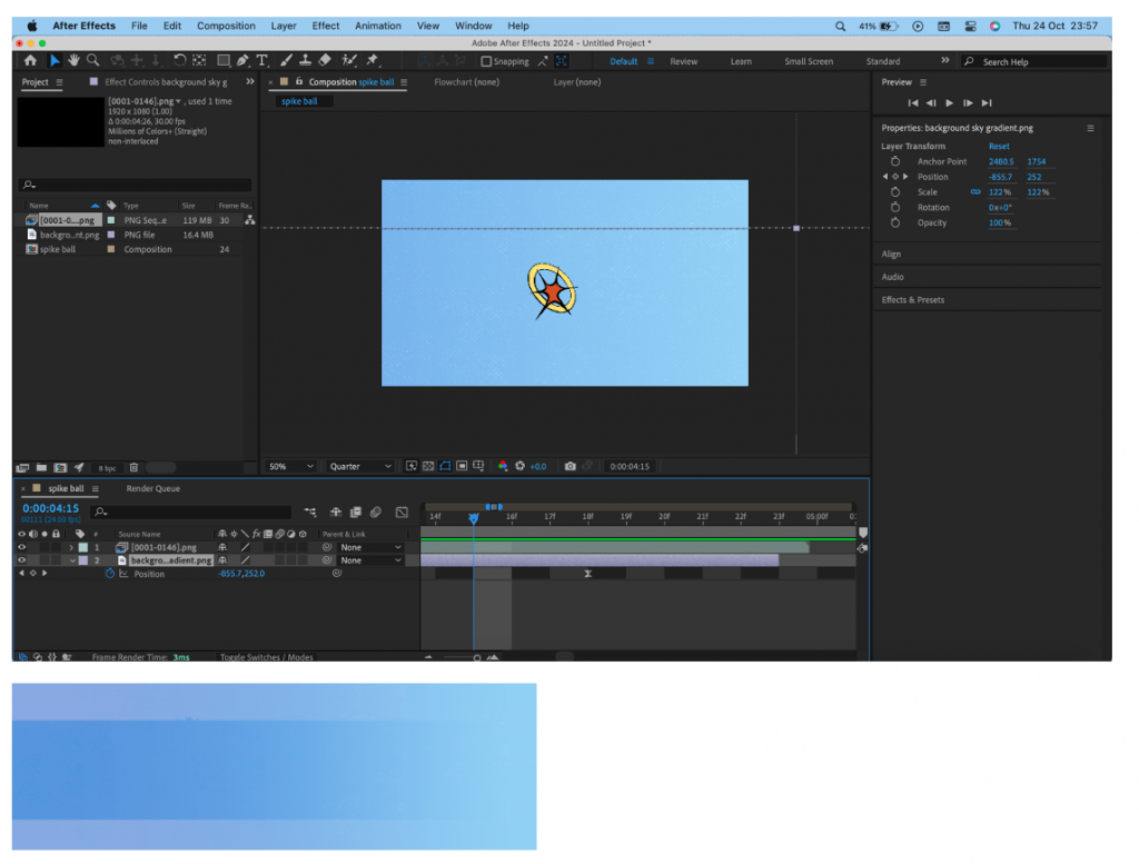
Blender was not very happy with me adding a background, but my best friend After Effects had no problem with it. Exporting my animation from Blender took a lot of trial and error, but I was able to (film settings transparent, render settings as PNG with RGBA) to create a PNG image sequence. I made a background in after effects in which the shape would move along and the background would get lighter.
I added a halftone effect in Photoshop because I thought that the style in which I had animated made the shape look like a POW effect bubble in a superhero comic. However, this texture made the directional movement of the background jarring and distracting from the movement of the shape.
I decided to keep the halftone texture, which meant i had to redo the After Effects movement. I had a slight zoom in on the background, and the background colour changes from a dark blue to a lighter blue as the shape becomes more and more energetic. I think this decision paid off because it was much less distracting than my first version. while it still retained some subtle movement to make the scene feel more interesting to the viewer.
FEEDBACK ON FINAL VERSION
- Good arcs and anticipation
- Background movement in the first draft could have been distracting
- Subtle colour change to highlight excitement
- The appeal is good, lines are clean and consistent
Rotation Evaluation & Feedback
This rotation was probably the one that I went into knowing the least, as I had never used GreasePencil before and I don’t usually use digital methods when it comes to animation. Despite this, I really enjoyed it, and I found the outcome satisfying to work on. I think that the most difficult part of the process was coming up with an idea of which emotion to convey for the shape’s movement, and I think I should have spent more time on the development and the character design part of the rotation, as this would have saved me lots of time when it came to animating, as I was still working out how the character would move and change while I was animating.
I was happy with the final outcome, especially how it progressed from the rough draft, which had a number of problems with both how I used the software and timing. This is where I found the feedback very helpful, as I was able to add and delete frames at points to make the pose-to-pose animation more exaggerated. I enjoyed learning about the 12 principles and focused on implementing arcs in my animation to make the movement look smooth. I found the process of animating in a precise way with the Wacom tablet very satisfying, and it made me finally realise that 2d animation is quite enjoyable when you are not animating on a trackpad. If I were to change anything about the final outcome, I would have added sound to emphasise the poses, such as a zipping sound and a massive explosion at the end to tie in with the exaggerated comic-book style that I created in this animation. In terms of the concept, I wanted to create the feeling of excitement, which turns into over-excitement and, therefore, anger. My caption for this animation was the feeling when you give a small child too much chocolate ice cream, and then they start beating you up. This was reflective of a personal experience, and therefore, processing this event was somehow therapeutic. Therefore, I enjoyed creating my concept, even if it took me several drafts and storyboards to come up with this change in emotion. 2D animation is now one of the areas of animation that I am most looking forward to , especially where it comes to more complex character design.